Retro '70s Vector Alphabet
Описание
RETRO '70S ALPHABET This one's retro-riffic! This vintage-styled original alphabet fits squarely between the end of the sixties and the beginning of the seventies. Stylistically, it was an era of wondrous and colorful creativity, with the popularity of animated psychedelic art films, Pop Art and Peter Max. The stylistic hallmarks are all here, radiating stripes, warm palette, and off-color rainbows, and when seen through the hazy lens of nostalgia, this type of work is absolute peak feelgood. Use the exploding starburst background as-is for a groovy template, or isolate any of the elements from this multi-layered .eps file and recolor them 'til your heart's content. IMPORTANT NOTE: This is custom vector art, not an installable font. You'll need to open the file in a vector editing program to access layers, switch off layers, select by color, etc. Saved in .eps format, compatible with AI 10 and up. After you have arranged the letters in a vector editing program, drag and drop the .eps files onto PhotoShop application icon to open in PhotoShop. This is NOT an installable font, but rather a set of colored vector letters that can be pasted together to create a custom headline for your graphic piece. In a matter of just a few minutes, you can copy and paste the letters to spell out a customized headline or product name, apply beautiful curves and contours if desired using Adobe Illustrator's Object Envelope Distort commands , and presto, you have a lovely, unique, and custom-lettered branding system or headline. And yes, it goes more quickly than you might think. This lettering is in the grand tradition of classic psychedelia, but has a slightly more eye-friendly and legible take than many of the classics, for more at-a-glance readability without losing any of the essential 'vibe.' For maximum authenticity, curve and warp your lettering design to your heart's content using the Envelope Distort function in Adobe Illustrator. TIPS FOR GETTING A PERFECT RESULT 1 Don't forget the kerning! This is often the difference between a good lettering design and a great one. After you've positioned the lettering on a straight baseline, give it careful look. Squint at it. Look at it from across the room if it helps. Close up the big wide gaps like you might see between an 'L' and an 'A'. Open it up a bit when dense letters want to dovetail too tightly together. Bottom line: Don't use math or rulers to kern the letters, use your eyes. If it looks too tight or too loose, then it is. 2 If you've positioned individual vector letters before, you probably know that letters with rounded tops or bottoms need to extend a little bit below the baseline and above the cap height line. Example: a rounded capital letter 'O' extends slightly beyond the lines at both the top and bottom, and a rounded capital letter 'U' extends below the line at the bottom only. This extra height most prominently on bold lettering counteracts the optical illusion of rounded letters naturally appearing smaller than the rest. 3 Try curving your words, rotate them around an arc, bend and warp them for great results. Adobe Illustrator's Object Envelope Distort is your friend. 4 The colors are editable of course, although in some cases, it may prove to be overly complicated to edit some of the multiple gradient swatches used for creating the 3-d style drop shadows and faux-metallic shine gradients. Experiment, and see what works. ABOUT THE DESIGNER Mott Jordan is a veteran typography designer and confirmed lettering fanatic. He has two ITC designs to his credit now administered by Monotype, Inc. , ITC Hornpype, and ITC Verkehr, as well as a large number of limited-release freebies floating around the web, dating back to the late 1990s. Jordan is also an artist, illustrator, animator, 3D designer, and photographer.
Характеристики
| _GoogleCategoryID: | 5032 |
График изменения цены & курс обмена валют
Пользователи также просматривали

$4.29
12v Led Flasher Adjustable Frequency Relay Turn Signal Indicator For Kawasaki Ninja 250r 500r 650r S1 250 S2 350 S3 400
aliexpress.com
$3.53
Air Conditioner Remote Control For Gree YBOF Controller For Gree YB1FA YB1F2 YBOF2 Remote Control Controller High Quality
aliexpress.com
$11.82
Phone Bluetooth Remote Control with Battery Room Tiktok Ring E-book Turn Page One Key to Turn Off the Screen Volume Adjustment
aliexpress.com
$13.99
Solid State Relay 10A-120A SSR-10AA 25AA 40AA SSR Single-phase JGX AC control AC 70-280VAC to 24-480VAC 10A 25A 40A AA
aliexpress.com
$24.00
Фон для фотосъемки с винтажными крапинками, тканевый фон для фотосъемки в горошек, крупный бинокль покрывало для фото RTS
aliexpress.ru
$1.83
Автомобильные наклейки «Орлиный глаз», забавные креативные наклейки для зеркал заднего вида, виниловые наклейки с автонастройкой, Стайлинг 16x4 см, Duad D10
aliexpress.ru
$0.88
2019 New Fashion Hot Rose Gold/Silver Alloy Letter Bracelet Snake Chain Charm Bracelet Female Personality Jewelry
aliexpress.com
$31.72
DJI Mavic Pro Camera Lens Gimbal Arm Motor with Flex Cable for DJI Mavic Pro RC Drone FPV HD 4K Cam Gimbal Repair Parts(used)
aliexpress.com
$26.08
Men's Jeans 2022 Spring And Autumn Fashion Men's Loose Harun Trousers Cargo Pant Ankle-length Pants, Black
dhgate.com
$57.33
high shoes low bred concord blue jumpman 11 11s basketball 25th anniversary metallic silver big size 13
dhgate.com
$225.00
100 шт. новый автомобильный Стайлинг 3D Серебряный 4matic 4matic задний багажник автомобильный значок эмблема наклейка
aliexpress.ru
$4.20
Beautiful 10mm blue shell simulated-pearl high quality women fashion necklace party weddings anniversary jewelry 18inch GE5324
aliexpress.ru
$3.79
Hip-Hop Monkey Brother Posters And Prints Funny Cartoon Animal Canvas Painting On Wall Art Picture For Living Room Decoration
aliexpress.ru
$3.99
Hot Rod Garage Tin Signs Tool Rules Motor Oil Metal Plate Garage Wall Bar Home Art Decor Vintage Iron Poster Cuadros A-3030
aliexpress.ru
$3,494.10
Portable RF Vaginal Renew Vaginal Tighten Vaginal Rejuvenation Machine RF Private Vaginal Tightening Beauty Machine
aliexpress.ru
$35.42
Pro'sKit MT-7615 Optical Power Meter 4 in 1 Multifunction Fiber Network/Disconnection/Lan Cable Tester Visual Fault Locator
aliexpress.com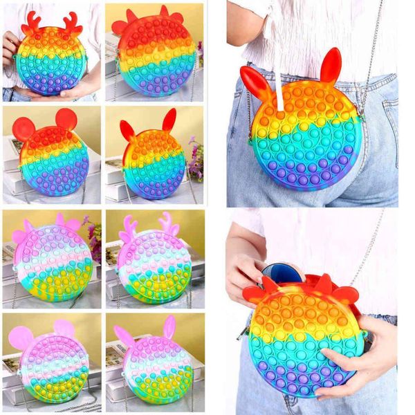
$5.59
rainbow macaroon fidget bubble chain bag purses kids boy girls novel cool design crossbody fanny pack push sensory puzzle toys early leaning
dhgate.com
$18.22
21SS Ader Error T-shirt Men Women Good Quality High Street INVADERS T shirts Alien Graphic Logo Print Ader 1:1 Tee Tops
aliexpress.ru
$9.39
Ladies Camisole Solid Color Top Casual Fashion Vest New Tops Slim Splicing V-neck Satin Summer Houthion
aliexpress.ru
$5.58
Nut Platter Candy Snacks Server Dish Party Living Room Home Dry Fruits Plate Food Storage Box 1pc Cute Fruit Shape
aliexpress.ru
$7.38
korean style silk yarn cloth headdress flower hair band hair rope hair band updo simple all-match hair accessories
fordeal.com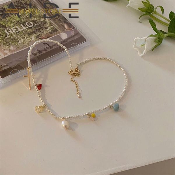
$8.78
chains aide pearl necklace female ins cold wind niche fashion design sense wild tide clavicle chain necklaces for women charming gift, Silver
dhgate.com
$9.53
Электронный тонометр на запястье CK-102S, Тонометр на запястье, Запястный тонометр, Хороший тонометр! Хит
prom.ua
$65.38
customize any name any number man women lady youth kids boys basketball jerseys sport shirts as the pictures you offer zz0162, Black;red
dhgate.com
$88.77
2019 designer brand studded spikes flats shoes red bottoms shoes luxury men womens party lovers genuine leather sneakers size 35-46 r05, Black
dhgate.com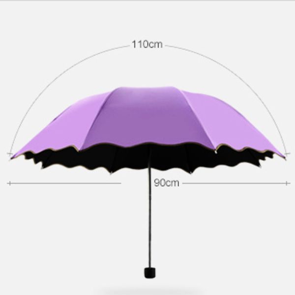
$33.05
purple uv protection women's umbrella beach umbrella discolored children's umbrella wind resistant three folding sun umbrellas
dhgate.com
$7.24
Air Conditioning Cleaning Bag Split Waterproof Protector for Voltas DYe 185 MYd 183 Eyi 183 MYC Delux 185 Dyi 123 Lye 125 CX
aliexpress.com
$5.65
Online Celebrity Douyin Hot Selling Little Red Book Ladies' Watch Women's Fashion Middle School Students Quartz Leather Belt Sim
aliexpress.com
$43.96
Ретро сумка большой вместимости Сумка для通勤 для женщин Повседневная наплечная сумка-подмышка Новая сумка-пельмень чёрный
joom.ru


