Hydrogen & Helium Alphabet
Описание
HYDROGEN & HELIUM ALPHABET Important Note: This is custom vector art, not an installable font. In the 1960s and 70s, the graphic designs and typography of the Art Nouveau movement the Jugendstil underwent a revival in popular culture in the United States and western Europe. Fifty years earlier, the nerve center for the original movement had been Vienna, Austria. Many amazing type designers were active there between the two world wars, including the designer of a masterful capitals-only alphabet called Desdemona. This font was one of the offerings from K. K. Hof-Schriftgiesserei in Vienna. Fast forward to the 1970s, and this basic style was reinvented and reinterpreted in the domain of rock band album and logo graphics. My design, Hydrogen & Helium, makes an obvious tip of the hat to earlier outings in this style, but while similar is not a precise match of Desdemona or any of the letterforms seen on 1970s-era album graphics. It also bears some similarities to a 1970s-era design by the brilliant Martin Wait, and also to the sans serif font family called Rennie Mackintosh, but with understated serifs. With this color palette, it stylistically crosses a bit into the steampunk zone colors are fully editable, of course . This is the first of a series of similar art nouveau / classic rock graphics designs that I will be releasing, and is a personal fave of mine. Saved in .eps format, compatible with AI 10 and up. Drag and drop the .eps files onto PhotoShop application icon to open in PhotoShop This is NOT an installable font, but rather a set of colored vector letters that can be pasted together to create a custom headline for your graphic piece. In a matter of just a few minutes, you can copy and paste the letters to spell out a customized headline or product name, apply beautiful curves and contours if desired using Adobe Illustrator's Object Envelope Distort commands , and presto, you have a lovely, unique, and custom-lettered branding system or headline. And yes, it goes more quickly than you might think. This lettering is in the grand tradition of classic psychedelia, but has a slightly more eye-friendly and legible take than many of the classics, for more at-a-glance readability without losing any of the essential 'vibe.' For maximum authenticity, curve and warp your lettering design to your heart's content using the Envelope Distort function in Adobe Illustrator. TIPS FOR GETTING A PERFECT RESULT 1 Don't forget the kerning! This is often the difference between a good lettering design and a great one. After you've positioned the lettering on a straight baseline, give it careful look. Squint at it. Look at it from across the room if it helps. Close up the big wide gaps like you might see between an 'L' and an 'A'. Open it up a bit when dense letters want to dovetail too tightly together. Bottom line: Don't use math or rulers to kern the letters, use your eyes. If it looks too tight or too loose, then it is. 2 If you've positioned individual vector letters before, you probably know that letters with rounded tops or bottoms need to extend a little bit below the baseline and above the cap height line. Example: a rounded capital letter 'O' extends slightly beyond the lines at both the top and bottom, and a rounded capital letter 'U' extends below the line at the bottom only. This extra height most prominently on bold lettering counteracts the optical illusion of rounded letters naturally appearing smaller than the rest. 3 Try curving your words, rotate them around an arc, bend and warp them for great results. Adobe Illustrator's Object Envelope Distort is your friend. 4 The colors are editable of course, although in some cases, it may prove to be overly complicated to edit some of the multiple gradient swatches used for creating the 3-d style drop shadows and faux-metallic shine gradients. Experiment, and see what works. ABOUT THE DESIGNER Mott Jordan is a veteran typography designer and confirmed lettering fanatic. He has two ITC designs to his credit now administered by Monotype, Inc. , ITC Hornpype, and ITC Verkehr, as well as a large number of limited-release freebies floating around the web, dating back to the late 1990s. Jordan is also an artist, illustrator, animator, 3D designer, and photographer.
Характеристики
| _GoogleCategoryID: | 5032 |
График изменения цены & курс обмена валют
Пользователи также просматривали

$15.33
Мужское осенне-зимнее бесшовное нижнее белье два в одном, шелковые мужские леггинсы, немецкие бархатные теплые брюки, осенние брюки для мужчин
aliexpress.com
$25.37
Женское пальто в клетку, длинное пальто в Корейском стиле на пуговицах, женская верхняя одежда, осенне-зимняя одежда для женщин
aliexpress.com
$14.36
Square Hose Turntable Cover Wall-Mounted Retractable Hose Reel Cover Waterproof And Sunscreen 420D Black
aliexpress.com
$12.53
40 Pcs/Set Fishing Rod Guides Tip 8 Sizes Pole Repair Kit Line Rings Eyes Set Rings Stainless Steel Frames
aliexpress.com
$35.45
Vintage Shoulder Crossbody Bags for Women PU Leather Women's New 2022 Trend Fashion Handbag Clutch Small Black Brown
aliexpress.com
$19.98
Колесо запасное для беговелов, надувное 12" в сборе, серебристое, алюминиевый обод, 00-170667
vamvelosiped.ru
$13.59
Matching Family Pajamas Sets Christmas PJ s Xmas Tree Letter Print Top and Plaid Pants Jammies Sleepwear
walmart.com
$3.42
Cute Lilo & Stitch Cartoon Anime Matte Case For Xiaomi 12 Pro Case For Xiaomi Mi 12 11 11T 10 10S 9 8 6X 5X Ultra Lite Tpro Pro
aliexpress.ru
$15.74
Office Lady Knit Dress Women Plaid Turn-Down Collar Bodycon Houndstooth Elegant Long Sleeve Wrap Dress
aliexpress.com
$6.54
New Arabic touchpad Keyboard Case for iPad 8th 10.2 Pro 11 2020 Air 3 10.5 Pro 10.5 7th 10.2 Cover W Pencil holder touchpad
aliexpress.ru
$2.27
black lives matterbillie eilish bangle bracelet girl silicone stainless steel bracelets women men bangles fans gift #35064
dhgate.com
$3.23
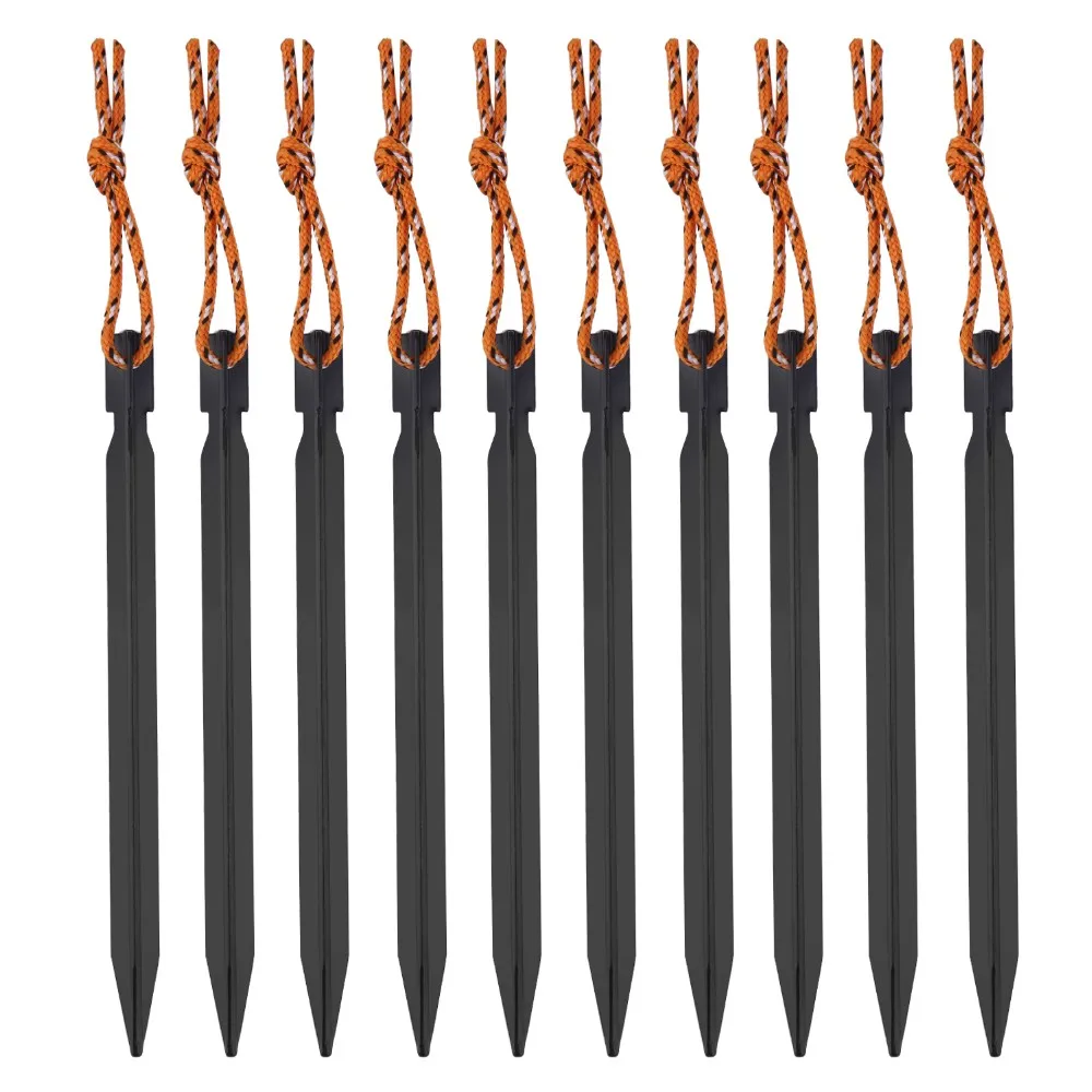
10pcs 18cm Tent Peg Nail 700I Aluminium Alloy Stake with Rope Camping Equipment Outdoor Traveling Tent Building include bag New
aliexpress.com
$8.12
EPULA 1PC Travel Zipper Bag Speaker Case High Quality Portable Travel Carry Bag Storage Case For Makeblock Codey Rocky Robotics
aliexpress.com
$28.49
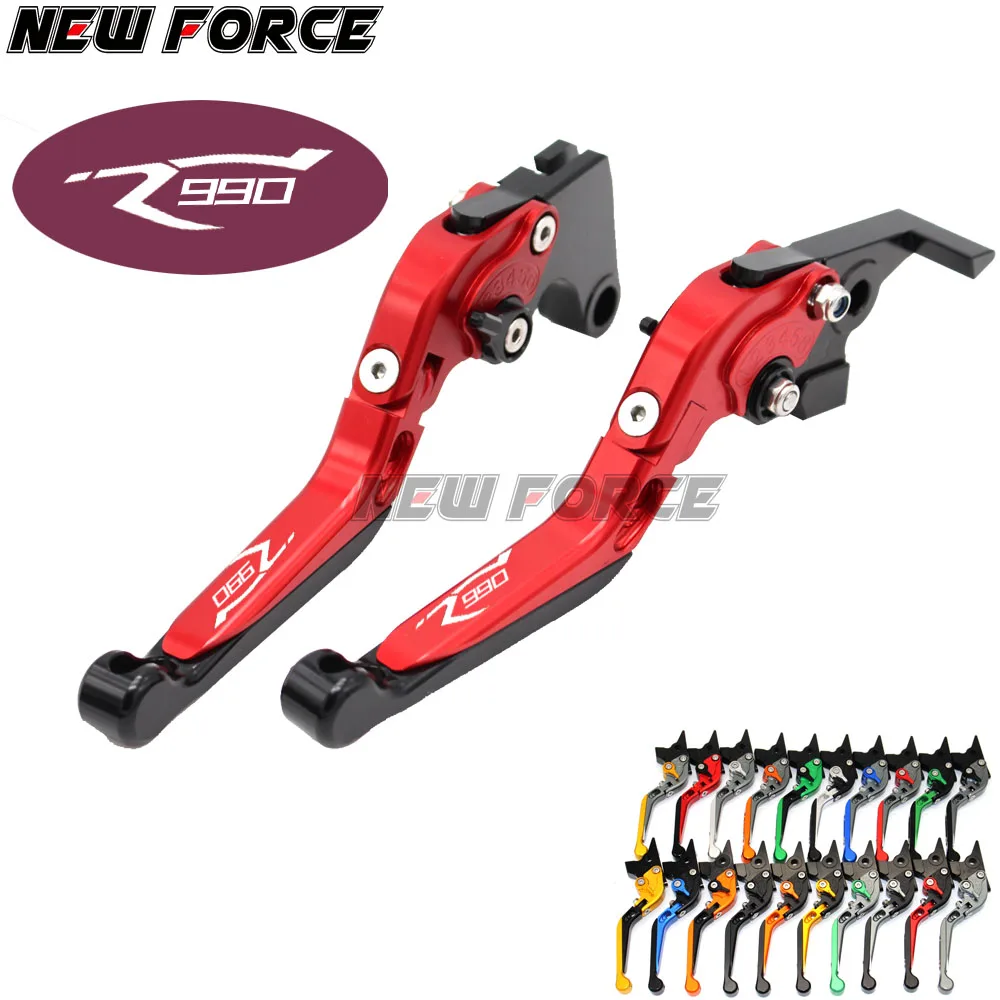
Motorcycle Brake Clutch Lever Moto Folding Extendable Brake Levers For KTM 990 SMR 990 SMT 950 SM 2009 2010 2012 2013 With LoGo
aliexpress.com
$34.99
2019 Fashion design dubai abaya flower embroidery kimono abaya front open muslim long dress women islamic clothing
aliexpress.com
$81.91
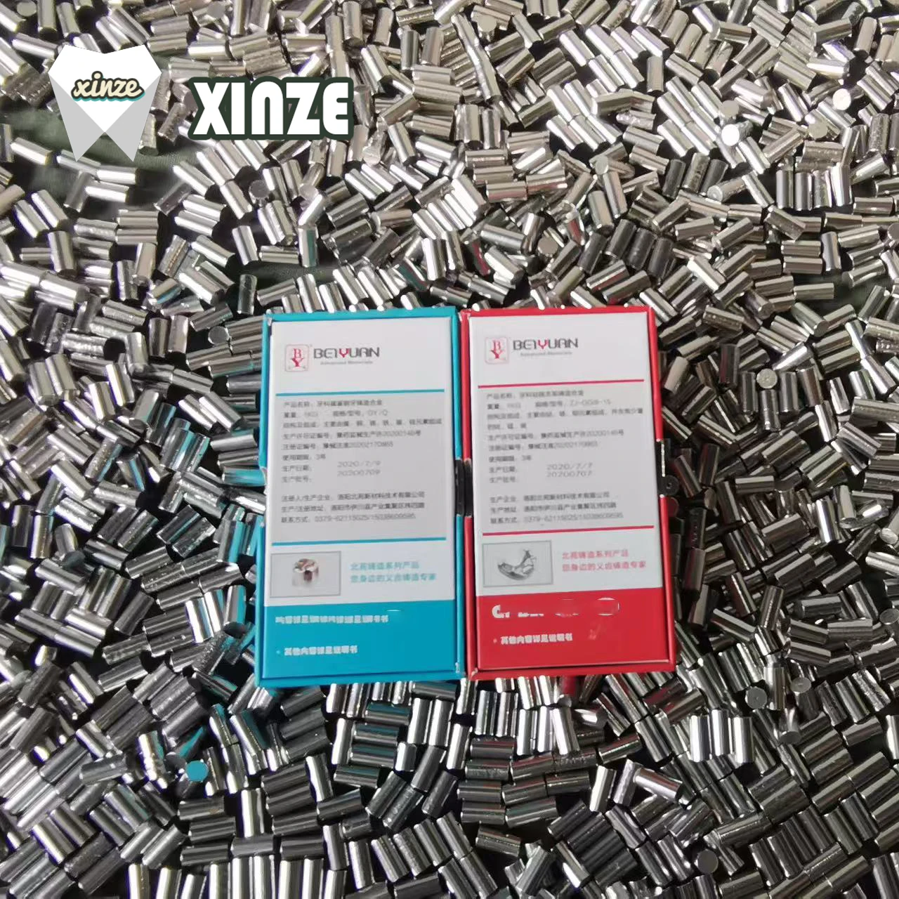
1kg Dental Nickel-chromium Porcelain Alloy Ni-Cr Lab Materials Cobalt-chromium Porcelain/frame Alloy CoCr Dental Lab Metal Alloy
aliexpress.com


