Ferrochrome Classic Car Alphabet
Description
FERROCHROME CLASSIC CAR ALPHABET Here's a tip of the hat to classic Detroit stylings from the golden age of American automobile design. This highly-detailed chrome 3d lettering art really delivers the goods for that sleek and buffed-out classic car look. Included with the alphabet are three glitter-paint style colored vector backgrounds. Important Note: This is custom vector art, not an installable font. Saved in .eps format, compatible with AI 10 and up. Drag and drop the .eps files onto PhotoShop application icon to open in PhotoShop This is NOT an installable font, but rather a set of colored vector letters that can be pasted together to create a custom headline for your graphic piece. In a matter of just a few minutes, you can copy and paste the letters to spell out a customized headline or product name, apply beautiful curves and contours if desired using Adobe Illustrator's Object Envelope Distort commands , and presto, you have a lovely, unique, and custom-lettered branding system or headline. And yes, it goes more quickly than you might think. TIPS FOR GETTING A PERFECT RESULT 1 Don't forget the kerning! This is often the difference between a good lettering design and a great one. After you've positioned the lettering on a straight baseline, give it careful look. Squint at it. Look at it from across the room if it helps. Close up the big wide gaps like you might see between an 'L' and an 'A'. Open it up a bit when dense letters want to dovetail too tightly together. Bottom line: Don't use math or rulers to kern the letters, use your eyes. If it looks too tight or too loose, then it is. 2 If you've positioned individual vector letters before, you probably know that letters with rounded tops or bottoms need to extend a little bit below the baseline and above the cap height line. Example: a rounded capital letter 'O' extends slightly beyond the lines at both the top and bottom, and a rounded capital letter 'U' extends below the line at the bottom only. This extra height most prominently on bold lettering counteracts the optical illusion of rounded letters naturally appearing smaller than the rest. 3 The colors are editable of course, although in some cases, it may prove to be overly complicated to edit some of the multiple gradient swatches used for creating the 3-d style drop shadows and faux-metallic shine gradients. Experiment, and see what works. ABOUT THE DESIGNER Mott Jordan is a veteran typography designer and confirmed lettering fanatic. He has two ITC designs to his credit now administered by Monotype, Inc. , ITC Hornpype, and ITC Verkehr, as well as a large number of limited-release freebies floating around the web, dating back to the late 1990s. Jordan is also an artist, illustrator, animator, 3D designer, and photographer.
Technical Details
| _GoogleCategoryID: | 5032 |
Price history chart & currency exchange rate
Customers also viewed
-89%
20%
$15.10
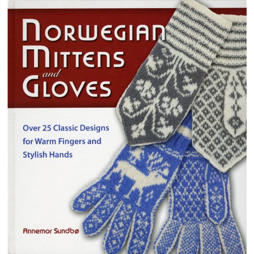
Norwegian Mittens and Gloves : Over 25 Classic Designs for Warm Fingers and Stylish Hands
abebooks.com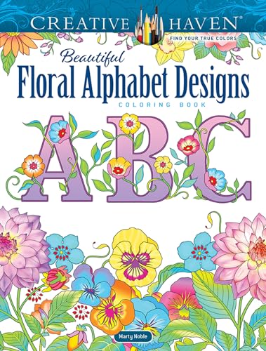
17%
$8.34
Creative Haven Beautiful Floral Alphabet Designs Coloring Book (Creative Haven Coloring Books)
abebooks.com14%
$2.80
wholesale letters alphabet rhinestone designs/bridal beaded lace appliques for wedding dresses
walmart.com
7%
$10.07
Making Alphabet Friendship Bracelets : 52 Designs and Instructions for Personalizing
abebooks.com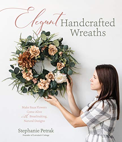
1%
$10.25
Elegant Handcrafted Wreaths: Make Faux Flowers Come Alive With Breathtaking, Natural Designs
abebooks.com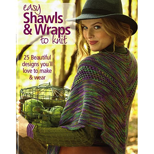
1%
$3.73
Easy Shawls and Wraps to Knit-For Every Season, 25 Beautiful Designs Youll Love to Make Wear
abebooks.com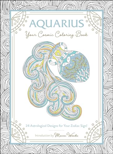
1%
$8.96
Aquarius: Your Cosmic Coloring Book : 24 Astrological Designs for Your Zodiac Sign!
abebooks.com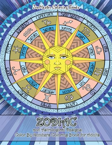
+15%
1%
$9.17
Zodiac and Astrological Designs Color By Numbers Coloring Book for Adults: An Adult Color By Number Book of Zodiac Designs and Astrology for Stress Re
abebooks.com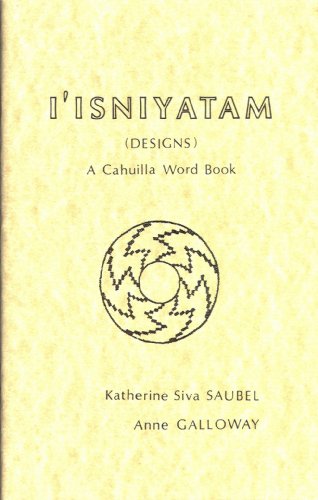
+56%
1%
$19.95
I'Isniyatam (designs): A Cahuilla word book (Indian languages of Southern California)
abebooks.com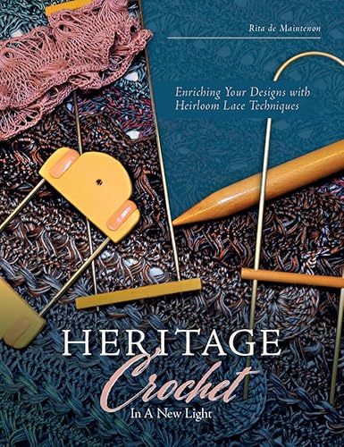
1%
$23.58
Heritage Crochet in a New Light : Enriching Your Designs with Antique Lace Techniques
abebooks.com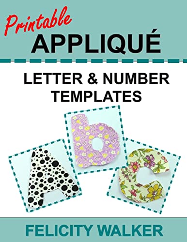
1%
$10.73
Printable Applique Letter & Number Templates: Alphabet Patterns with Uppercase and Lowercase Letters, Numbers 0-9, and Symbols, for Sewing, Quilting,
abebooks.com
+9%
1%
~ $168.00
Новые туфли для мужчин Кожаные повседневные туфли Роскошные туфли с острым носком для вечеринок Уличные трендовые туфли-лоферы со стразами и короной 37 чёрный
joom.ru
1%
$6.21
4pcs Garden Pots Wedding Roman Urn Flowerpot Plastic Wedding Road Flower Containers Pedestal Style Planter Pots Standing
aliexpress.com
1%
$7.41
Белый деревянный держатель для ручки, карандаш, аксессуары, органайзер, контейнер, Кисть для макияжа
aliexpress.ru




![Victorian Needlepoint Designs [first edition]
Victorian Needlepoint Designs [first edition]](http://pictures.abebooks.com/isbn/9780486231631-us.jpg)


